Newsletter Materialien (EN)
Materials tell stories
Every material has its own language—a story that is retold through the artist’s hand. In this newsletter, we explore the unique surfaces, textures, and techniques that bring works of art to life. Every detail reveals a unique dialogue between idea and material.
Gerhard Hoehme uses acrylic, twine, and writing on paper to explore the tension between structure, gesture, and sign. In his platinum-palladium print, Gilles Lorin combines photographic precision with the precious luster of gold leaf. In his etching using aquatint and drypoint, Otto Dix explores the expressive possibilities of line and tonal values, while Karl Schmidt-Rottluff translates the energy of the printing block into powerful surfaces in his color woodcut. Rolf Nesch develops an experimental process with colored metal printing that combines relief, color, and material effects. Svenja Schüffler combines engraving, colored pencils, pastel chalk, gold leaf, and ink to create complex layers of imagery that blend painterly and graphic elements.
In the detailed close-ups on display, the techniques take center stage—they reveal just how deeply the choice of material is interwoven with the artistic statement. For here, it is not only the motifs that tell a story, but the materials themselves.
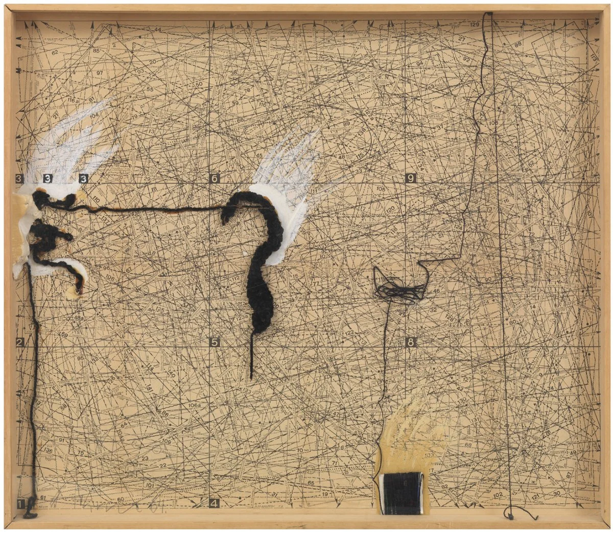
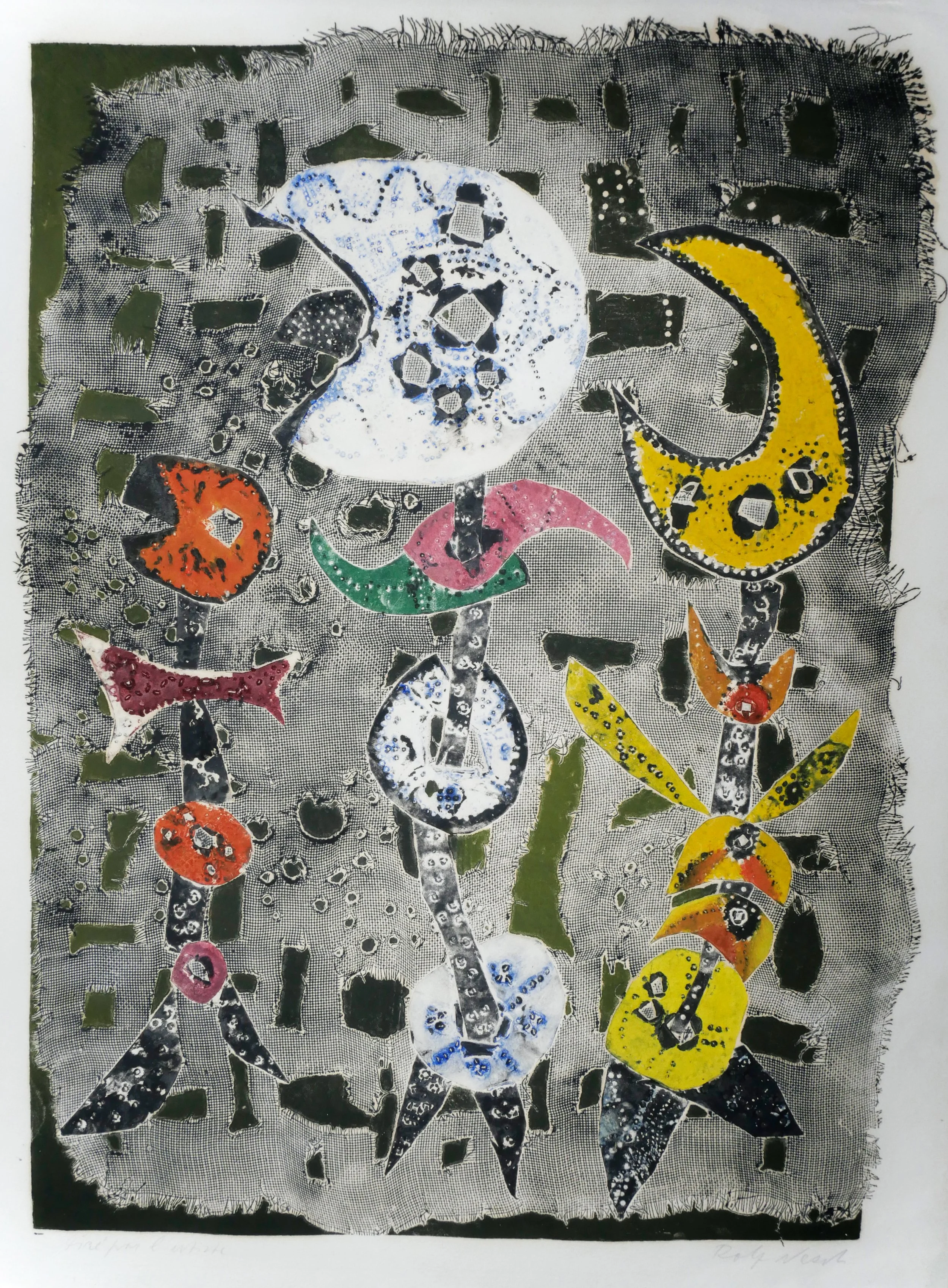
Gerhard Hoehme
3-3-3-EINHALTEN 3 BIS 3
Assemblage with collage, acrylic and cord on cut-outs. 1964.
Starting in the mid-1960s, Hoehme began to experiment more and more with materials beyond traditional plastics. Among other things, he used pattern sheets as a support for his images and incorporated industrial materials such as plastic film and colored polyethylene tubing into his works.
Hoehme’s works—which cannot be clearly defined as either images or objects—embody the principle of the “in-between.” His entire artistic practice revolves around forging connections: between the work, the viewer, and the space; between the material and the spiritual.
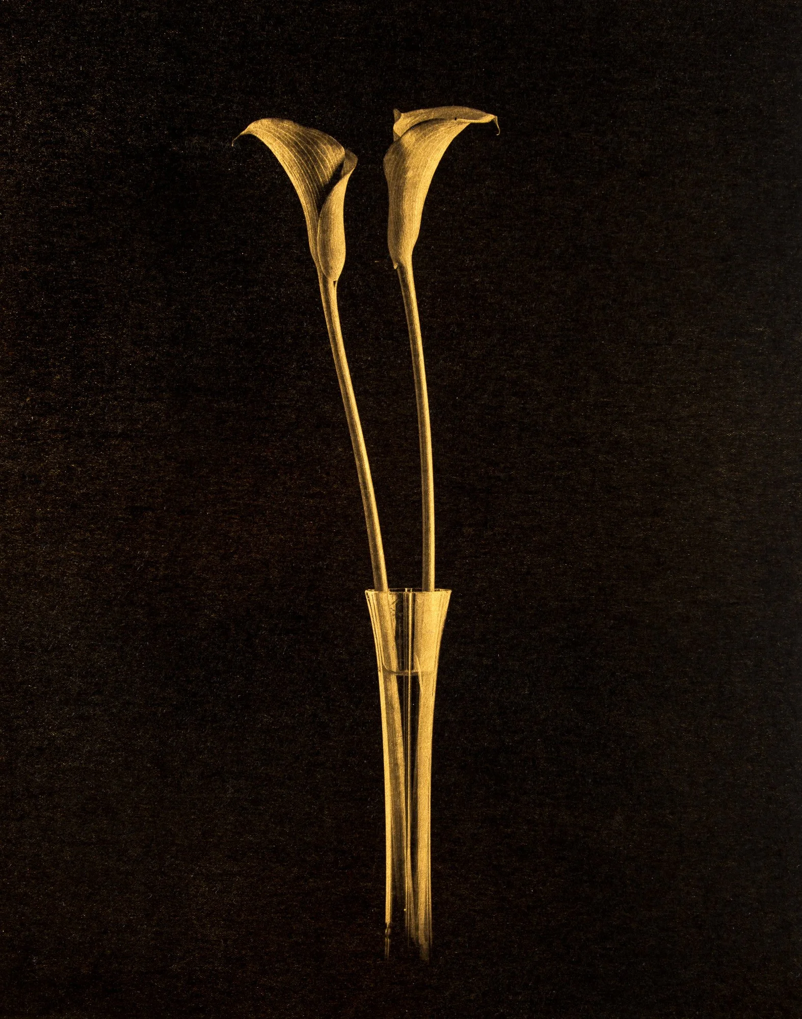
Gilles Lorin
CALLA
Platinum-palladium print, gold leaf. 2017.
"In my work, I take great care in choosing my materials, because that is precisely what helps me convey the idea or mood of a photograph. Gold leaf has been used in art across many cultures and for thousands of years to celebrate the divine..."
Gilles Lorin
Through the rough hatching and stark black-and-white contrast of the etching, Dix further explores scenes of war-wounded soldiers, brothels, and barricades. Even in portraiture and the nude—the main domains of realism—Dix uses his etching needle and lithographic chalk to explore the diversity of these subjects, demonstrating both psychological insight and a keen eye for individual characterization. The etchings in aquatint and drypoint were created in three stages from the fall of 1923 to early summer 1924. Dix was particularly fascinated by the versatile and expressive aquatint technique: “Wash off the acid, apply the aquatint—in short, a wonderful technique with which one can work the gradations entirely at will. The process suddenly becomes incredibly interesting; when you etch, you become a true alchemist.”
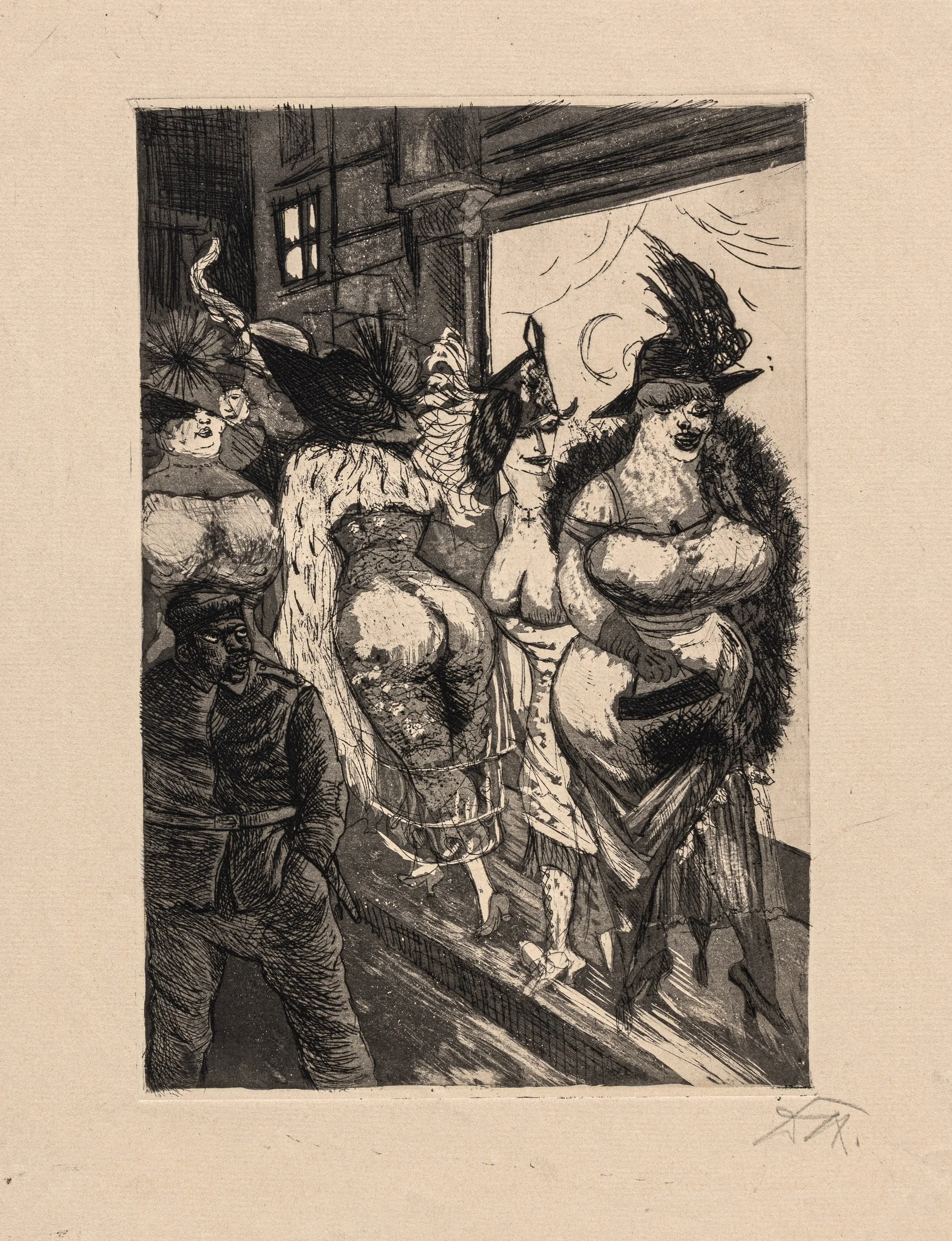
Otto Dix
FRONTSOLDAT IN BRÜSSEL
Etching, aquatint and drypoint. 1924.
When Edvard Munch saw woodcuts by Karl Schmidt-Rottluff in 1907, he sighed, “May God protect us. We are heading into difficult times.” Whatever the reserved Norwegian meant by that, he sensed the power that lay within the young artist and saw how he wrested unprecedented creative possibilities from the unwieldy wood.
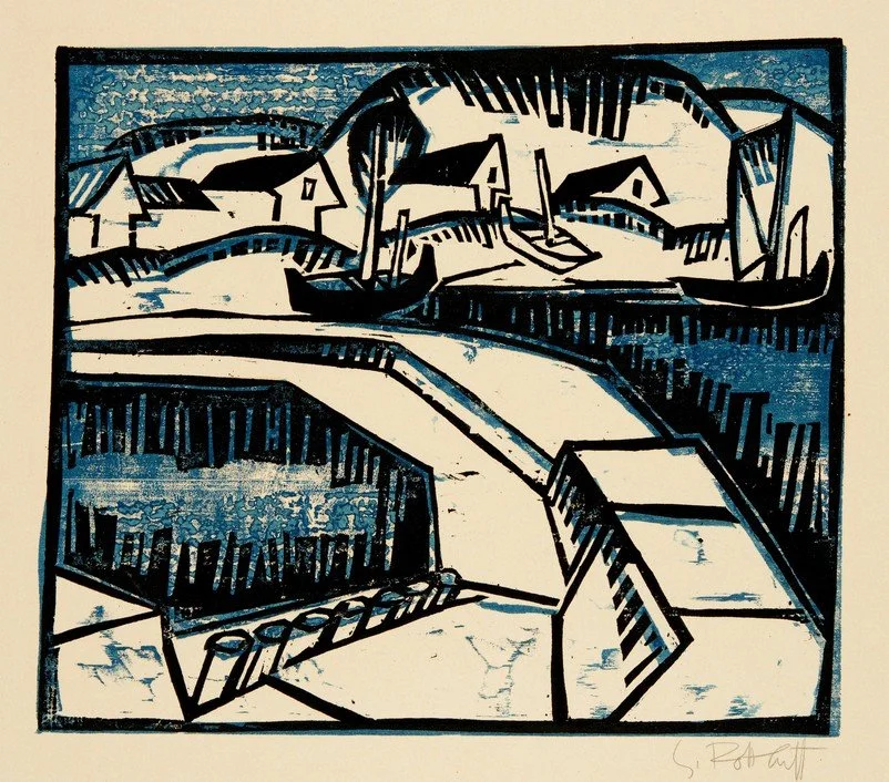
Karl Schmidt-Rottluff
DÜNEN UND MOLE
Color woodcut. 1917.
The eminent art historian Dr. Wilhelm Niemeyer (1874–1960) later found the perfect term for what had so unsettled Munch: “surface force.” The harshness, the relentlessness, and at the same time the generosity with which Schmidt-Rottluff expressed his artistic language were both visible and palpable.
Rolf Nesch
FIGUREN I
Color metal print. 1955.
“Nesch's fundamental interest in exploring unconventional ways of using printing materials and techniques led to the development of what is known as the metal-printing technique. Nevertheless, the fact that he was the founder of a novel method of artistic printmaking is not the only reason for Nesch’s special standing within 20th-century graphic art. Equally remarkable is the expressive character of his prints, a distinctive quality that in turn stems from the artist’s ability to fully exploit the inherent pictorial potential of various materials and techniques.”
Sidsel Helliesen/Bodil Sørensen, Rolf Nesch. The Complete Graphic Work, Oslo 2009, S. 13.
Svenja Schüffler
LUDWICH (WITNESS III)
Scratching, pastel chalk, india ink, gold leaf. 2021.
Using metal tools that appear to have come from a surgical kit, Svenja Schüffler etches exquisitely fine mesh and line patterns into the paper. She then refines these subtly textured surfaces with pastel chalks—all executed with the utmost delicacy and precision. The result: embossed drawings of dizzying detail and a lifelike, three-dimensional effect—illusionistic feasts for the eyes that make us question the reliability of our perception. Svenja Schüffler masterfully combines her drawing technique with both ancient and modern techniques such as gilding, frottage, airbrushing, and assemblage.